.png)
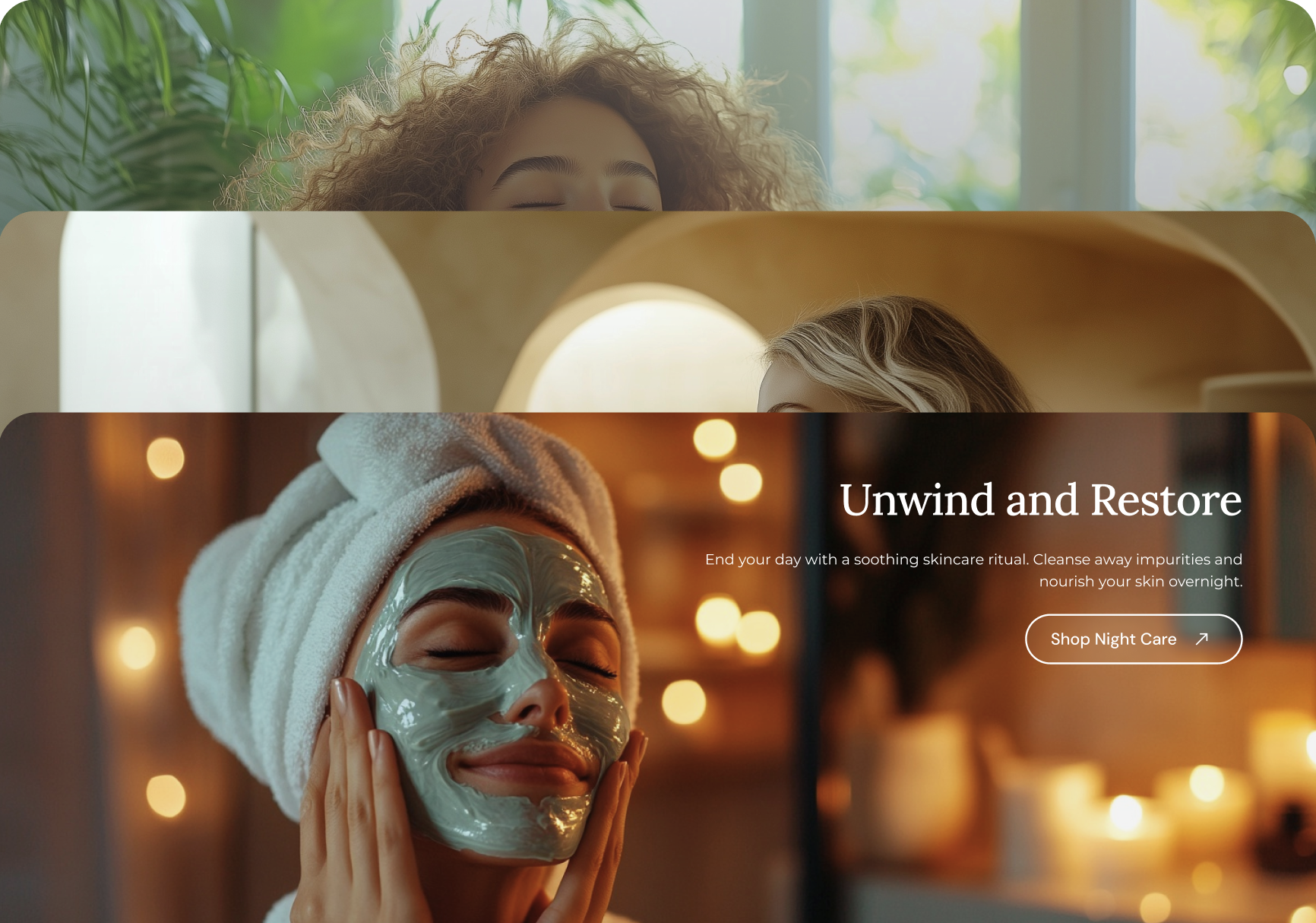
Reveal media with text overlay
The Reveal Media with Text Overlay section creates a parallax effect by switching images with text overlays as users scroll. This section is perfect for showcasing impactful imagery with engaging text.
How to add reveal media with text overlay section
.svg)
- Access the Theme Editor: Navigate to `
Online Store > Themes > Customize`. - Add a Section: Click on `
Add section`and select the desired section from the list of available sections. - Customize Your Section: Adjust the settings such as display type, alignment, and visibility according to your preferences.
If you need a more detailed, step-by-step guide on accessing the theme editor, adding sections and blocks, refer to our Setting up theme sections and blocks article.
General section settings
Within this section, you'll find common settings like containers, visibility options, and color settings that are consistent across all sections. For more detailed information on these shared settings, please refer to the Common settings between all sections article.
Unlike the other sections that contain a section header, this particular section does not include one. Instead, the content is presented as blocks that overlay the image within the section.
Section Settings
- Media Height on Desktop: Choose between small, medium, large, full-screen, or custom heights for desktop.
- Custom Media Height on Desktop: Set a custom height (300px - 1000px).
- Media Height on Mobile: Choose media height options for mobile, including custom height.
- Custom Media Height on Mobile: Set custom height for mobile (300px - 600px).
- Overlay Opacity: Adjust the image overlay opacity (0% - 100%).
Block Settings
- Image for Desktop: Upload an image specifically optimized for desktop devices.
- Image for Mobile: Upload a mobile-optimized image to ensure better mobile performance.
- Video: Embed a YouTube or Vimeo video by providing the video URL.
- Subheading: Add a subheading to provide additional context. Choose from small, medium, or large sizes.
- Heading: Add a main heading for your block. Sizes include small, medium, large, or extra-large.
- Text: Add a rich-text area to share descriptions, announcements, or welcome messages.
- Text Enlargement: Option to enlarge the text, making it stand out more prominently.
- Content Position on Desktop: Position content within the block (top, middle, or bottom) and align text to the left, center, or right.
- Content Position on Mobile: Set how content is positioned on mobile (top, middle, or bottom) for improved readability on smaller screens.
- Content Alignment on Desktop: Control the alignment of your text on desktop, either left-aligned, center-aligned, or right-aligned.
- Content Alignment on Mobile: Align text for mobile (left, center, or right) to enhance mobile experience.
- Content Maximum Width: Define how wide the content area should be (400px to 700px) to maintain a consistent layout.
- Content Spacing (Vertical): Adjust the vertical spacing between content elements for better visual balance (40px to 120px).
- Content Spacing (Horizontal): Modify horizontal spacing between elements (0px to 120px) to ensure the content is well-spaced.
- Show Content Background: Enable or disable a background color behind the content for visual contrast.
- Content Background Color: Set the background color for the content box.
- Content Background Opacity: Adjust the transparency of the background (10% to 100%) for subtle or bold effects.
- Primary Button: Add a button with customizable label, link, and style options (primary or outline). This button serves as the main call-to-action.
- Optional Button: Add a secondary button with label, link, and style options (primary or outline) to provide a secondary call-to-action.
